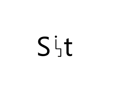
This is a very interesting logo. I really like the "I" put in that way and it is in the middle which is stand out.