Hokkaido Travel Landing Page UI UX Web Design
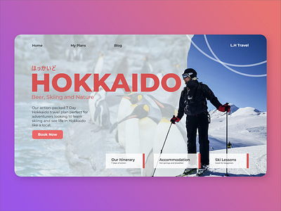
The idea of using two images and composing them like this was inspired by a post on Instagram (Which I forgot the link). I used red as the main colour of the site as it is a colour well used in asian culture. The bold typography creates a modern and simple look for the user and the Japanese hiragana above gives it a stylistic touch.
