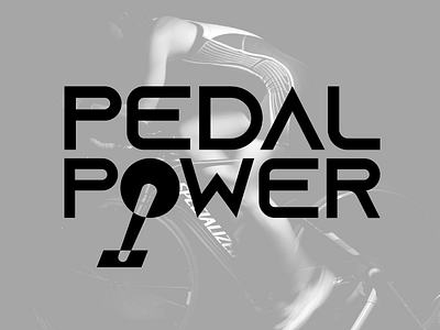
Pedal Power Cycle Gym Brand Identity
Cycle gyms and at-home stationary bikes are all the rage right now. Of course, I didn't let the challenge of creating a "P" logo to compete with the almighty Peloton scare me. I just said "challenge accepted!".
So, I present to you the Pedal power logo, in all its bold, athletic, minimal glory. I found the perfect, modern sans-serif typeface (and a free one, at that- Google "Azonix") and found an effective way to integrate a geometric bike drive crank into the logotype. The result: edgy and sleek.
There are two variations of the logo, and I think it pairs very well with some dramatic, "Apple-y" photos, like shown.
More by Colin Merrill View profile
Like


