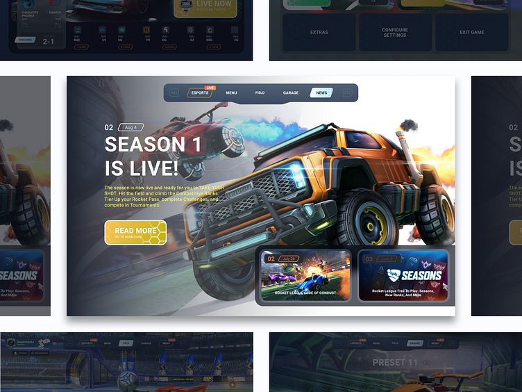
Rocketleague UI Redesign Concept | Screen 1/5
I've been a fan of rocket league since i first saw the trailer in early 2015. It is the game that I have spent most time on, period. Not too long ago, Psyonix, the company behind the title (now working under epic games), made the game fully free. Together with this release, they also changed some UX/UI elements for the game. Even though it has freshened up the game (some say), I believe there are a lot of element to the design (specifically the menu/navigation) that are changed, rather to please the eye, than to imrove usability. So, what greater way to do some designing of my own, than to give this my own take, and redesigning some of the rocketleague main menu screens.
Imagine a menu layout (like a lot of games these days i guess) that is navigated horizontally between the different screens, or rather subparts of the menu. This way less buttons take up space on the screen, so the player can see more of their beautiful supersonic acrobatic rocket-powered battle-car.
You're looking at my concept of the news-section. I think it would be an improvement to show the player more of the upcoming updates and patches, within the game. Making everything more integrated, gather everything in one place. The current way news are shown, is by a full screen overlay that slides in when you open the game for the first time after an update, or if you open it by yourself (duh). I think it's slightly hidden, even unnoticed by the user this way. Psyonix is relying a lot on social media for inforing the community. Though this works fine, I'd argue informing the player through the game itself in a greater manner, could reach a larger number of players and so raise anticipation, and finally result in an overall increase in the amount of players that revisit the game.
It's christmas season. I wish you dribbbler a very cozy and safe winter for the remaining of the year (2020). Stay safe and warm! 🎅🎁🎄
