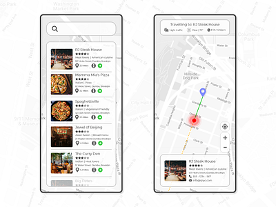
#DailyUI - Day 29 - Map
Day 29 of 100 days of #DailyUI designs. Day 29 is a design for a map app. I'm going to be honest in saying that I really didn't enjoy this one.
This is a very similar app to the tracking app earlier on in the challenge and as with that one, its a challenge to get away from the standard Google maps design that is so firmly etched in my brain. This is also made difficult by the fact that maps often include a lot of information.
I decided to go for a monochrome design for this one with pops of colour for pertinent information. Overall I'm happy, I feel like it could have been worse but I'm glad to have this one done with.
More by Alex Gaillard View profile
Like
