Mini UI Tip - How to combine colors

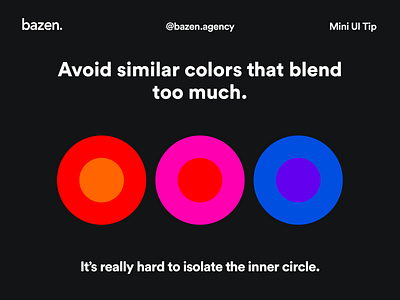
Carefully combine your colors! 🤓 _ Choosing colors that are too similar can also be difficult to observe, for the simple reason - we cannot establish a clear boundary between them and they seem a little blurry, depending on their similarity. Our eyes are under a bigger pressure and it gets harder to isolate colored objects and patterns. _ Here's what it might look like 😊