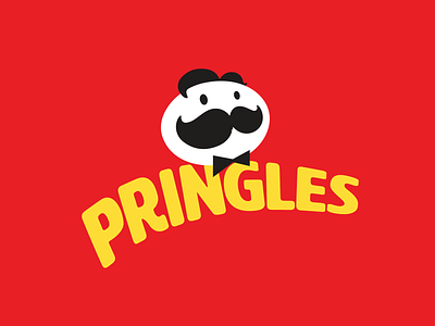
Pringles Redesign
This is my take on the redesigned Pringles logo and brand identity. I think the new design that they implemented had a couple misses such as replacing the hair with eyebrows, and making the eyes and mustache too large, which to me, resulted in it looking like a somewhat different character than the Pringles man - like his cousin or son or something. So I revised the logo with the same minimal look, but with added hair, adjusted mustache and eye sizing, and changing the bowtie to black instead of red, since I believe that the bowtie is a brand identifier, but not necessarily the fact that it is red.
I also revised the word mark to match the minimalistic logo by removing the stroke and selecting a new font. I think that the Pringles team probably wanted to keep the same word mark for brand identity, but it is outdated and the stroked design does not match the new design of the Pringles man. I kept the same curved path but selected a new typeface that was still personable, but created a little more excitement and movement.
Feedback appreciated! Thank you
