Cutty Sark rebrand

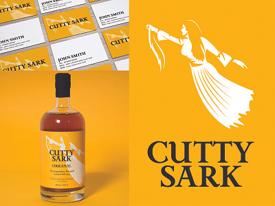
Student work. A rebrand for Cutty Sark whiskey that shifts the focus from the ship to it's namesake; the witch from the Tam o' Shanter poem.
https://www.jandersondesign.co.uk/cutty-sark
Student work. A rebrand for Cutty Sark whiskey that shifts the focus from the ship to it's namesake; the witch from the Tam o' Shanter poem.
https://www.jandersondesign.co.uk/cutty-sark