EGGAIN web studio
Full cycle web studio required naming, logo, identity and landing page. Special request — use the word “again” in the company name.
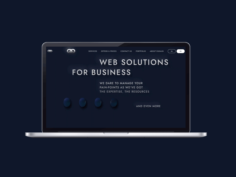
EGGAIN — interesting pun, sounds like again, but includes two words (egg and gain). Based on the name of the company, an egg was chosen as the main element of the identity.
It symbolizes the full cycle in solving problems, and the readiness for any projects, even very complex.
The logo is a composition of two letters G, the outlines of which look like eggs. They are united as links in a chain of precious metal.
The buttons and decorative elements are also made in the shape of an egg.
Fonts:
Jost medium, 48 px, 28 px
Rubik light, regular, 22 px
So, thank you for watching ❤️, and welcome to
Eggain
We have 🥚🥚
