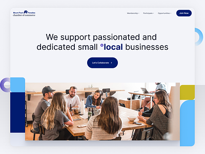
Website Hero
I was creating few different art directions for a client within chamber of commerce space.
They have problem with the current website as it's not communicating the right message and content is not easy to consume.
In this version, I wanted to have simple title explaining what they do and also to include community vibe with shapes, colors & photography.
As they didn't have much of branding assets, I came up with these rounded shapes with idea of showing connection.
I've been setting this Home Page direction for the nice people from Upstream Marketing Agency
——
📨 Have a project? Feel free to email me → [email protected]
👉 I started sharing process behind my projects on Twitter
Read case studies on my Website
More by Marko Ilic View profile
Like
