ZMB logo

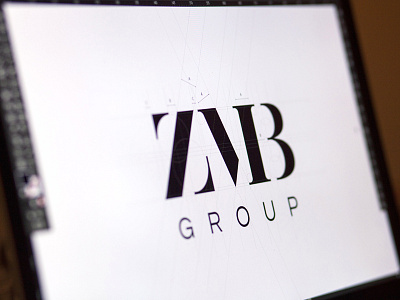
I'm working on a really lovely typographic approach for a finance company called ZMB Group. They wanted something aesthetic and modern yet conservative enough so their costumers (varying in age) can receive a clear message of stability and simplicity. I was kind of scared that the letters eventually won't be easy to spell apart but luckily everybody who has seen it could spell it correctly so I'm very happy. Any suggestions, comments welcome!