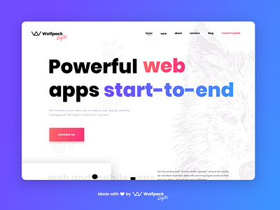
Wolfpack Digital Website Re-design - Creative Session No.3
Hello Dribbblers! 👋
You've probably seen our shot from a while ago with our awesome website re-design. But as with any design, ours comes with a story too. 🎨
🧭 In order to explore all options, our team of talented designers 👩🏻🎨👩🏼🎨👨🏻🎨👨🏼🎨 worked individually to express their vision and add a bit of 💛 on how our website could look like.
This is the very first design from a series which we'll be posting in the following weeks, done by our Wolf-zigner, Cristi! 👨🏻🎨
👨🏻🎨 Designer's take:
"When I worked on this re-design, I started with a fresh vision in mind and tried to incorporate a more playful yet professional take on our current website. By adding large type to emphasize the different sections, the users will find it easier to navigate and quickly scan the page, without too much effort. Also, to give the page some depth, I chose to go for gradients and soft shadows which makes the transition between actionable and non-actionable elements easier."
Wolfpack Digital website was designed and developed to showcase our love for building meaningful mobile and web apps.
Check it out and leave your thoughts in the comment section. Also, to read more about the pack, follow us on: LinkedIn | Medium | Twitter 🙌
Stay curious and don't forget:
"Dare to be different! Be bold or italic, but never regular!"
P.S.: Pun very much intended!


