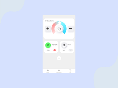
HomeKit Control App Gone Wrong
The longer I stare at it i realize there is something wrong about this UI, I don't know why I put direct AC control with Lights and Door control on the Home Screen. At first I believe it will be good to have quick control over everything but then I don't thinks so. Your feedback is gladly welcome!
home homekit lights mobile app mobile ui smarthome ui ui design ux ux design
More by Fadel Farinsqi View profile
Like
