Hooli Merchant - UX/UI
Hooli is a fintech specialist, gives bank solutions with biometric security to the users and merchants.
We facilitate the usability in the app with biometry, avoid risk and user complications. This is the great different characteristic that Hoolli has. Any money movement, buy or request that the user needs would be validates biometrically. We ensure that the user is who he say be.
Doesn't exist a passwords, bank codes and payment complications. With this borned the characteristic phrase of the brand: Simple, fast and secure!
I created the user experience and interface design. Also, I leaded part of the development team.
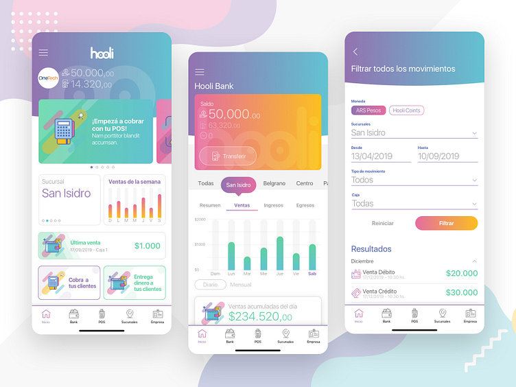
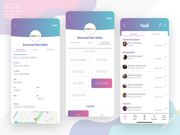
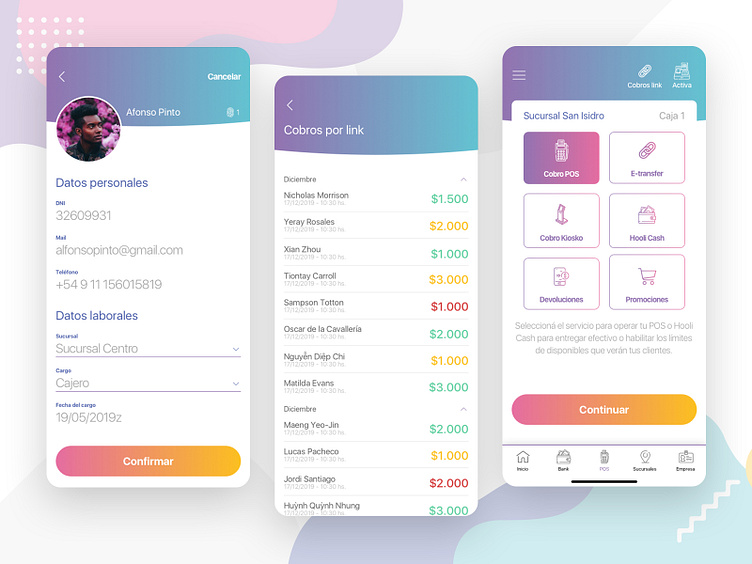
The chromatic pallet was a desition to create dynamism, variability and represents the different characteristics to people. I what to users feels integrate with the brand. The person variability that use Hooli is big, from teenages and adults. The chromatics vars and balance reflex this persons integration.
The typography used is the native of any operative system (San Francisco in iOS and Roboto in Android), a font dry stick doesn't compete visually with the rest of elements and it very easy to read. Also create integrity to read level and assimilation for the user.
The iconographic use is important because exist a lot of functions and concepts in the app. This elements, actions and concepts need to be explains and translated for the users. The iconographic representation is the easiest mental model for visualization of the environment.
Motion-ui is very important in Hooli because the interaction help that end user can focus his attention in the content. Also I use this technique to create fluid in the interaction.
For know Hooli you can visit my project in https://dribbble.com/matiasmartinucci/projects/3015834-Hooli or enter in https://hooli.la/
----------------------------------------
Hooli es una fintech especializada en dar soluciones bancarias con seguridad biométrica a sus usuarios y comerciantes.
Una de las grandes características es que mediante bromearía facilitamos la usabilidad general de la app, evitando riesgos y complicaciones para el usuario. Cualquier movimiento de dinero, compra ó solicitud que quiera hacer está validada biométricamente, asegurándonos que la persona es quien dice ser.
No existen contraseñas, claves bancarias, complicaciones de pago. De ahí nace la frase tan característica de la marca: Simple, rápido y seguro!
Estuve a cargo del diseño de experiencia e interfaz de usuario. Además, liderando parte del equipo de desarrollo.
La paleta cromática implementada es para generar dinamismo, variabilidad y representación de las diferentes características de las personas. Intentar de que cada usuario se sienta reflejado en la marca. La variedad de personas que utilizan Hooli es muy grande, pasando por adolescentes y adultos. La variabilidad cromática y el equilibrio de su uso refleja ésta integración de personas.
La tipografía utilizada es la nativa en cada sistema operativo (San Francisco en iOS y Roboto en Android), una fuente palo seco que no compite visualmente con los elementos y es muy fácil de leer. Además, genera integridad a nivel de lectura y asimilación al usuario.
El uso de iconografía es muy importante porque existen muchas funciones y conceptos en toda la app. Todos estos elementos, acciones o conceptos necesitan ser explicados y traducidos para que un usuario común pueda entender muy fácilmente de que se está hablando ó que es lo que se quiere hacer. La representación iconográfica es el modelo mental más fácil para visualizar las cosas.
Motion-ui es muy importante en Hooli porque brinda la interacción y vida necesaria para que el usuario siempre tenga el foco de atención en lo que realmente necesita. También utilizo ésta técnica para generar fluidez en la interacción.
Para conocer un poco más de Hooli pueden ver mis otros trabajos en https://dribbble.com/matiasmartinucci/projects/3015834-Hooli o ingresar directamente a https://hooli.la/
