Lighting Studio Website Concept
Hello Dribbble,
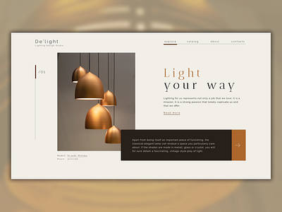
Here is a new shot of the website design for custom lighting studio. Made with Figma.
The main aim was to create a modern, sharp-looking layout with good negative space usage to make a feeling of lightness. Overall design uses also dark slides for more luxury and loftish products.
We reduced navigation to the minimal functional look and used a vertical side navigation for slides to bring and save that sharp lined feeling.
Hope you like it! As always, any constructive critiques highly welcomed! :)
More by Andrew Naichuk View profile
Like
