Personal Profile

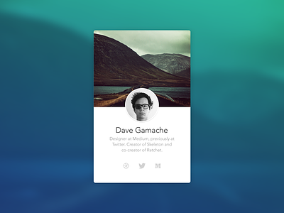
You absolutely nailed it @Dave Gamache. You chose my all time favourite gradient colour combo for the background overlay.
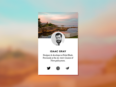
I thought I'd take a stab with a couple of subtle design changes: I ramped up the contrast on the text and icons, I opted to use a serif font for the bio, set the name in heavier small-caps, and I went with no radius on the corners and a hard drop shadow. Also bumped the midpoint of the circular photo down just slightly below bottom of the header photo.
For those interested (ie. type nerds), I used Equity Text A for the bio and Concourse Caps 6 set lowercase for the name. Both designed by Matthew Butterick.