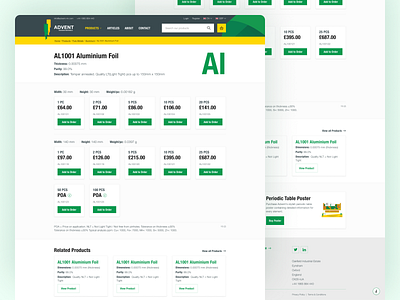
Advent Product Page
The final "listing" page for Advent is actually the product individual page – this is where it became really confusing on the old website (as it looked exactly the same as all the other listing pages).
This page went through several designs – one of which was a product configurator where you’d select your product options and it’d change the following field values based on what you chose.
The reason we decided to not go with that was because the user lost the ability to quickly compare the price of products where the only different was pack size.
This is the design we ended on, an individual product has some commonalities e.g. thickness, purity etc. but a product could also have a different width, height and weight on top of that each one of these groups could have it’s own number of packs which determines the price of the product.
This layout focused on removing repeated information (like the old design) so the user only has to compare information that is different instead of having to figure out what is the same between products.
Created at Syndicut.
Need help with your project?
Get in touch 📮 [email protected]

