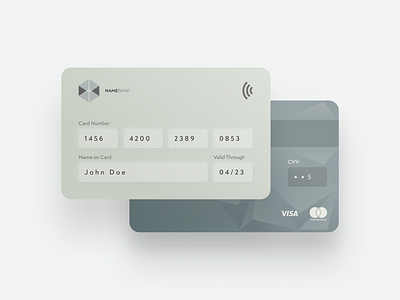
Daily UI #2 ~ Credit Card Checkout
Simple credit card form for another #DailyUI project. @awsmcolors used. Watch more on Behance!
Do you think we still need to make a card look like a real one? I mean, such elements as NFC label or electronic chip are no needed either in an app or on a website. Shouldn't we get rid of them already?
More by Inna Strazhnik View profile
Like
