GRAVITY
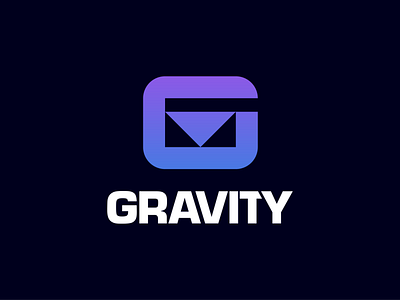
here again my Gravity logo and the construction. I wanted to create a simple and meaningful symbol and i think i succeeded quite well 😜
As font i used Eurostil. A strong font that supports the symbol and in my opinion harmonizes wonderful. I adapted the „V“ a little bit so it fits better to the „A“. I also shortened the „T“ so that the whitespace between „T“ and „Y“ is not so massive.
This is a personal Project.
— —
Feedback is always welcome
————————————
👉 Let‘s start a project together!
👉 www.daniel-rotter.de
————————————
Links:
Instagram | Linkedin | Behance | Pinterest
bike
branding
ebike
e bike
golden ratio
gravity
icon
lettermark
logo
mark
minimal
monogram
mtb
pedelec
saas
sports
sports logo
symbol
technology
typography
View all tags
Posted on
Sep 10, 2020
More by Daniel Rotter View profile
Like


