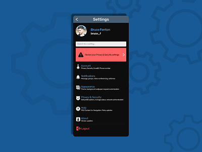
Settings page
As a problem solver understanding the user's POV has become an obsession. Digging deeper into the end user's mind is very important. And like this empathy is established. This neural connection is the key to streamline and half the problem is solved. When architecting the information-heavy, functional UI we must be keen on the big buckets we are providing on that particular screen. And that is why screens like setting (the backbone of the solution) should be very specific and should not make much cognitive load. Some things like mapping, bucketing the information, essentials items must be taken care of. Also, it should be legible and scannable both visually and typographically.
More by Digvijay Phadke View profile
Like
