Royal Scaffold - Concept 2
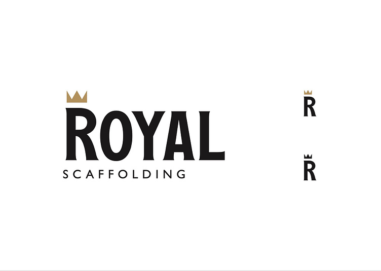
Royal “R” – Concept 2 BOLD/TRADITIONAL Serif typography has been used to create a more traditional style. Additionally, “Royal,” has been set in all- caps which adds to the regal theme as, making the type seem “proud” and “confident” as though. “Scaffolding,” has been set in “Gill Sans,” which is a discreet British typeface and has been chosen for its legibility and the contrast it provides when countered the serif typography. In lay-mans top texts seems fancy because the subtitle is intentionally plain.
