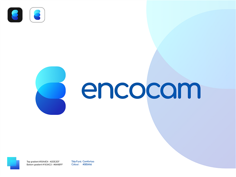
Mockup: Encocam v2 Spread
In this version I wanted to make a more "chunky" decal, in essence, something more robust looking with no uneven gaps like the original business logo full of empty space to show the lettering at https://encocam.com/
I also got inspiration on the layout from Lelevien.
I needed to merge them in a form that encompasses design and engineering with purpose. So I took a look into my original double C concept and them began to compress and remove the gaps that were tell tale for the E and instead use two simple shapes and let the eye be dragged along the contours to assume the shapes and not blatantly express them with the slits on the E. So what I have is two C shapes overlapping to form an E.
This is what I came up with to fulfill that design challenge and one of the more complete results that I would have shown the client if this were an actual project for them.
Full project on https://qegadesign.myportfolio.com/encocam
