404 Page
Hello!
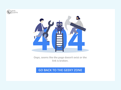
I designed this 404 page for the website of Geek Gazette, technical magazine of IIT Roorkee. You can check out the website: https://geekgazette.iitr.ac.in/.
Through this project, I learnt the importance of 404 pages. I realised how well they should be connected and integrated with the website in terms of typography, colours and UI. It should feel like a part of the website apart from giving the user an engaging error message and keeping them informed.
Apart from this, I learnt the value of white space in design. There are not 4 elements in the page, but 5 of them: Logo, Illustration, Description, CTA and most importantly, the white space.
Happy designing! :))
More by Yavnika Garg View profile
Like
