Playoff - MX Logitech Lettering
Appreciate any feedback.
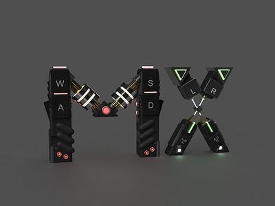
I started with sketches on the MX lettering and wanted to at first represent an era when I first used a logitech in the late 90s early 00s, and thought of making it fit with that theme and colour of tech in the 90s. I then worked on some advertising pieces with metaphors and branding and then it came to me as the lettering was constructed in robotic plate and mechanical pieces like a custom controller almost. Inspiration likely came from my recent replaying of the game Prey. I dove into grips, pieces of designed tech, lighting and materials to represent this and constructed design sketches and how I might make each piece in Blender.
My PC could not handle the load and so I turned to Dimensions a little program I have been using for a few weeks now and built up a white version (rebound final no material version in comments) with all the trimmings from my sketch. I then worked away at the composition to draw the eye along and the contrast where I thought needed it to be. I removed some fun pieces like flame vents and futuristic flares in favor of a more well rounded piece (rebound in comments) . Then, the materials came into it, placing the materials for grip, touch and visual appeal on it all with light bits to mark which button is being pressed, you will notice a light spot above each letter (also referenced this in my sketches to visually place the common keys on them as any controller would have). Originally the X had WASD and the M had L/R given the visual points, however it looked odd as I tend to use WASD with my left hand and use the mouse in my right - not always the case in gaming but it seems to be the majority, so it was switched.
Going back and forth then adjusting rotations, layout, materials to getting the feel right took its time, with me wanting full renderings with a few sets of lighting.
I was limited however by what Dimensions could do, in terms of custom shapes, I managed to make a few in Blender and import them, like the angled lights, the W and S keys that curve on the top, but mostly a Dimension shape build. In terms of lighting I originally had a gem in the middle of the X, but couldn't light it well from within itself, without loosing the brightness on one end or the complete shape of the gem on the other.
Chose the same sort of angle as the original, we didn't know the font so I sketched on top of a screenshot and then created a flat version to then import and build the framework in front of. May not be 100% accurate.
I do have other versions, but decided this lent itself to the least busy, kept the form of the MX intact more and didn't blur the shape too much, though they do look cool.
Grey background to let the lights shine their best, but keeping it light enough so the frame isn't lost, it was such a delicate balance. Also listening to Waveshaper albums helped a little in this so don't discount your musical listening when making things. I wish I could animate this but I am not an animator.

