LARS - User experience and interface design (UX/UI).

LARS is a mother brand that nucleates four relevant and well-established fashion brands in the Uruguayan market. This is why the design of the webpage was fundamental and had to follow their brand identity.
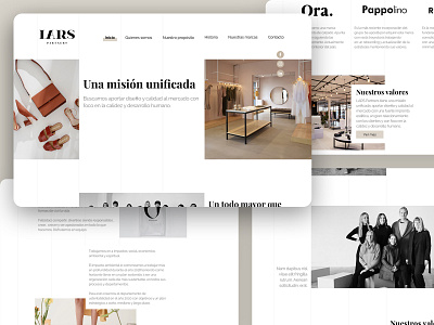
Just as their clothes, the website had to be minimalist. We decided to focus on their stores, which are elegant and trendy but minimalist and innovative at the same time. LARS stores are carefully designed following their main color palette: white, black and beige. With their webpage, we wanted to deliver the same feeling of entering one of LARS stores. This is why our designer chose the same color palette: a clean black and white interface with full-color images as if the background were the walls and the images were the clothes. The elements on the webpage are placed following a grid, that represents racks and hangers in the store. The grid is irregular, it goes from side to side. Elements such as text, images and buttons are overlapped. When buttons are pressed they are filled with color (beige) also in an irregular way. This is because LARS, since its beginning, has been breaking down standards and conventions in the Uruguayan fashion industry. The typeface style chosen was New Roman (associated to fashion) for the titles and Sans Serif for texts.
This is an example of a design-oriented website, developed using the latest web technologies. It's 100% responsive, able to adjust to every device. We and LARS team are very happy about the results.
To view the project, click on the link below.