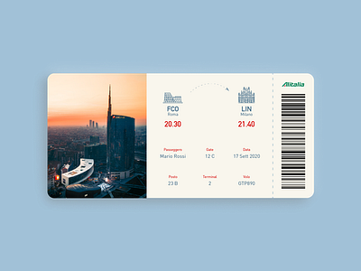
Daily UI_024_#Boarding Pass
Hello guys!
Here is my flight ticket idea: I tried to keep it very CLEAN and simple, I used icons to recall the cities, and I put the times very big and bold because that's usually the main issue.
Then, I moved from left to right and from the top to the bottom for displaying the info according to what the passenger needs more: the seat, the terminal, and the gate. Then the date and the flight number.
There is a barcode (I generated one saying "Buon Viaggio" just for fun) and the company logo.
Ah, on the left, a nice picture of the destination, Milano, the city where I've lived and studied for 6 years. Hope you like it and appreciate the ui.
More by Elena Paglia View profile
Like
