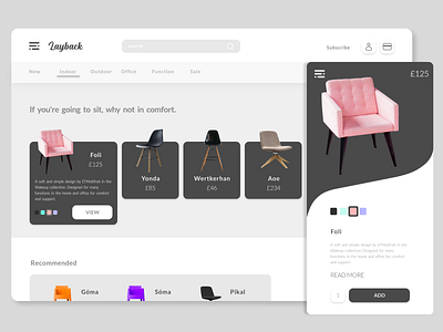
Layback Furniture Store
Rebound of Shop destop app by Alexey Savitskiy for NORT.
I liked the ideas in the original, the presentations etc. I was looking at inspiration of overlapping in designs and this one stuck out at me as a simple and effective use of overlapping. I worked in my own versions such as the buttons, the menu layout and context distribution in the mobile screen and lesser in the desktop screen. I felt the Add/purchase button has to be more prominent as well as including a read more button for an accordion style drop down of information like dimensions and shipping. I also shifted the price away from the reading information, and included a contrasted menu on the mobile view as well.
I tried something new as well for the "pay/basket" option as I have issue with defunct iconography or terminology. So I filtered down what the cart/basket option really was: to pay. I made an icon I felt more applied to a "go pay" option. I would like to know about the psychology of seeing card icons instead of a basket or a cart.
Whereas in the original the contrast of shapes was in the swatches (circular) and the content boxes (rounded boxes) and the "add to cart" (half rounded box), I stuck with the same for all content container except one, introduced a contrast in the mobile view with the large content box.
Images from Unsplash.

