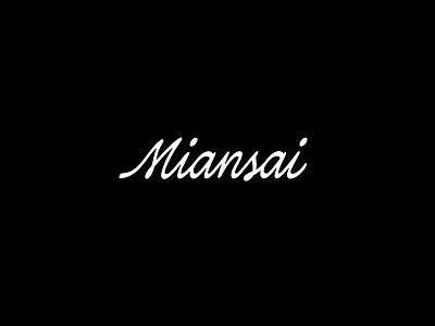
Logotype Redraw #3 — Miansai
Miansai is a jewelry brand. They have redesigned their logo once, from a rather messy brush to a more toned down script. But I feel their current logo is a bit "cheap feeling" and doesn't portray their current offerings and their social media contents.
I'm opting for a script that feels a bit more premium, not too luxurious and have a nostalgic feeling.
This is a part of ongoing series I started recently to practice my lettering by redrawing existing logotypes.
Let me know what you think on the comments 💌 or if you have any request which logotype should I redraw next 🎯
More by Laurensius Adi View profile
Like
