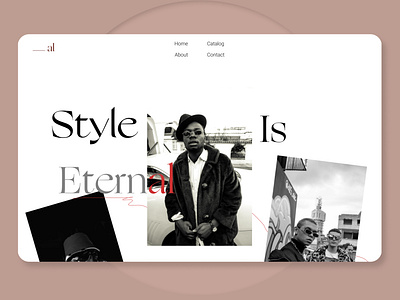
Website for clothing brand
Hello guys, It’s me Amr, today back to you with a fresh UI design for a clothing brand website “ al “ or as they call themselves The Homies
•The idea : This website is obviously not an e-commerce so the point is not to sell but to tell a story and that’s what a brand is, it’s the words and emotions you provide your clients with, you know who they are, what they eat and how they speak, which words they prefer to put up in their conversation, so, I can call this website an online catalog in other words a live album for this clothing brand.
• Colors: We all know how colors contrast play a vital role bringing in life to whatever you design, orange and yellow for hospitals? Not a good idea, but taking a step back and seeing what the brand has to offer you even in terms of colors, that’s exactly what I did here. Black and white are not just a perfect match but a good composition we see in the style of their photography, showcasing their fashion.
• Fonts: I recently bought 2 fonts and in the near future will be investing even more money to setup my font library, but for 1 more time I decided to combine 2 of my fav fonts Ogg-Roman + GrandSlang and they really created the harmony I needed to imply in my concept, I felt the hesitation flexing when I thought of bringing such 2 fonts in one page thinking that they might overlap each other, well, it was vice versa.
• Structure: As I explained above, it’s an album. I thought of my photo album of my childhood and knew that it’s not perfect, it has those messy cross offs and faded photos, which led me to the decision that this design has to look almost the same, strokes are a good idea to lead your eyes somewhere while scrolling, knowing at which stage of getting to know the story of the brand are you!
Well, that’s pretty much it for this design guys, make sure to share your thoughts with me, tell me why you liked and what you didn’t, criticism is highly appreciated 🙏
Take care and have a good night everyone :)
