Valid Logo Candidate No3
No3 of my search for the new Logo of my web identity.
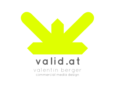
I like this one, as it's got such a catchy and simple shape and it's concept is just very easy to explain: two arrows running together, resulting many V-shapes and plenty of room for interpretations. I kinda like the idea, that it's on the one hand converging to the inside and on the other hand spreading out like en explosion.
as this is anything but final, consider it as a rough sketch, open for critique and feedback, so I'd be very glad if you guys could share your opinion with me by posting comments, thanks!