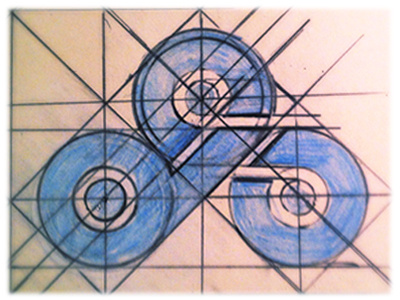
Logo Concept
I'm finishing up my new personal website and I'm working on a logo for it. I wanted to create a logo that worked as both a lettermark and a symbol at the same time. After lots of trail and error this was the concept I came up with and I'm very happy with it. The three circles, bunched in a triangle, form the two letters in the website title, "D" and "S".
The only area that gives me pause is where the circles of the, "D" and the upper portion of the "S" touch. Everywhere else in the concept the circles are seperated a bit, but when I played around with adding space between those two circles, or all three, to allow for space the design became unbalanced. Does the fact that those two circles touch bother anyone else? If the circles that made up the, "S" were unbroken then all three would touch so I'm wondering if I'm over thinking it.
I would love some feedback and thoughts. Thanks everyone.
