Hydroelectric Dam Logo and Information Folder

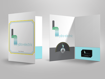
I wanted to create a logo that resembled the meaning of a word. Hydroelectric dams are an efficient, clean energy source that works off of the flow of water.
The slate gray stem of the “h“ resembles the vertical structures while the curve displays water-flow.
Ideally, this design would be used by an organization that manages a hydroelectric dam’s maintenance. Here it is used for a CD manual and apparel.