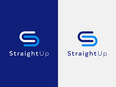
Clean Logo Design For An Auckland Software Business
New Auckland software company, StraightUp approached us to create their logo design and full brand identity. This simple and clever logo concept plays on the initials of the brand. The letter ‘U’ has been repeated in a reflective pattern to create the shape of an ‘S’. It expresses the idea of teamwork, connection and collaboration between employers and employees. The icon gives the brand some movement and character while maintaining a professional feel.
Hop To Us To View More Projects
Follow the White Rabbit 🐇
Website | Instagram | Facebook | Behance | Pinterest | YouTube
Like what you see? [email protected]
More by White Rabbit View profile
Like
