User Interaction design for a photographer portfolio
Hello Guys,
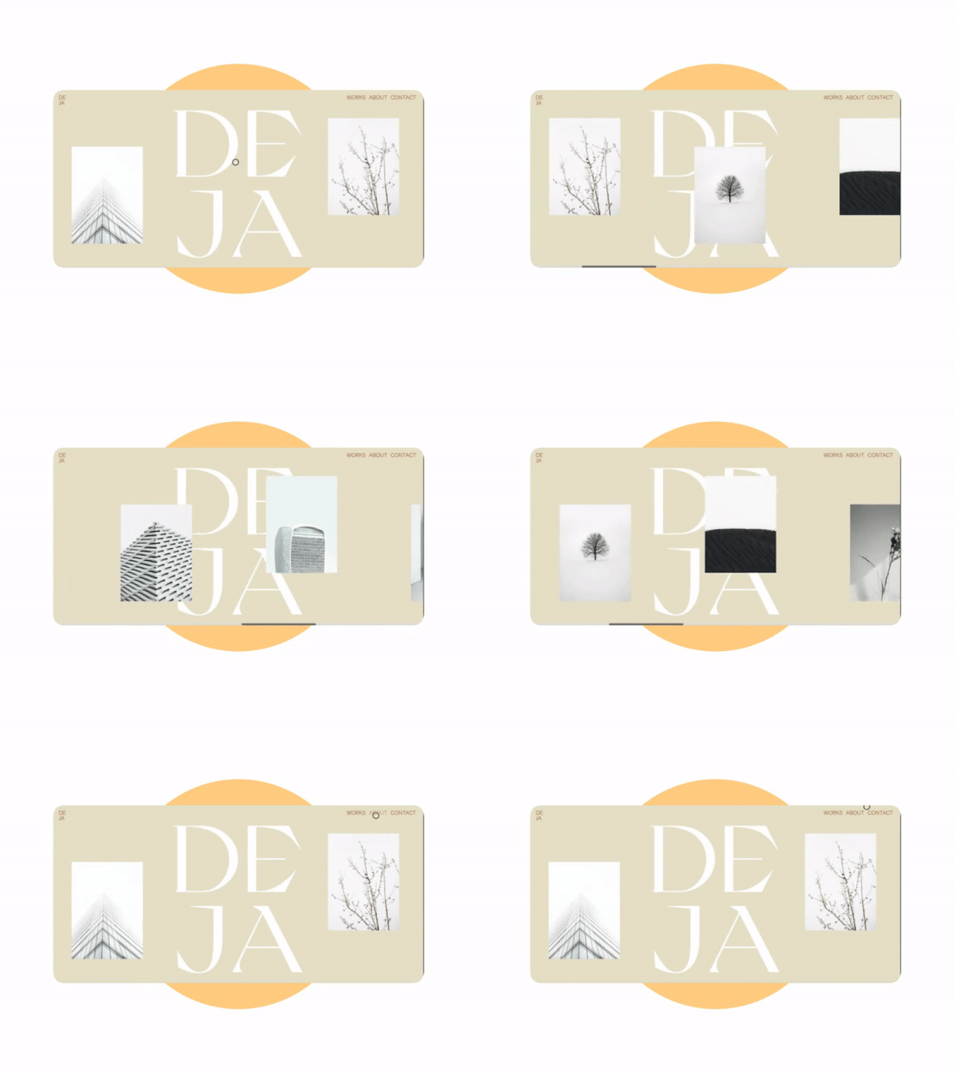
So, for this user interaction, I decided to go with a horizontal scroll as in my opinion it's a better way to showcase photographer/designer's work, wide spaces between the project photos are displayed to give the website a room to breathe and feel more width.
The font: Grand Slang designed by Nikolas Wrobel, a great fancy typeface for luxury projects
The colors: again, I decided to go with nude colors to give the website visitors a chill feeling, fitting the typeface used
At the end, I would like to get your feedback, know your opinion and whether anything can be changed to make this design better, feel free to write a comment and chat with me :)
I hope you like it.
More by Amr Elwan View profile
Like
