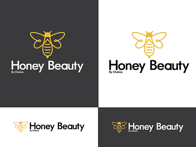
Honey Beauty Logo Design
So this is what I come up with for a logo/branding concept for a lash extension business. I went with a stylized honey bee illustration with some very clean typography (Jost).
When researching logos of other lash places a loooot is a heavy script. This can be hard to read, they also aren’t very scalable and can look a little tacky.
This style is a little different from the competition but has a very modern and pronounced style about it, which stands out from other brands.
I went with the bee because of the honey part in your name, but I also thought about how the wings represent lashes. Lashes are like little wings being attached to your eyes
Let me know what you think.
Hit L is you like it.
More by Lachlan Collis View profile
Like
