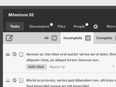
Rule Projects v2 (a "Lited" view)
Full-version of concept: http://urls.fm/S
After months of scrutiny, the Rule.fm team is considering redesigning our Projects module based on demand for the concept (or something similar) provided in this snap.
There are far too many issues with our existing Projects module to ignore, so we've gathered what user-input we could get our hands on and as a result, we've come to this "lited" (black and white, minimal stylization) concept.
One of the first things you might notice is that it looks and will seemingly behave similarly to Twitter, though deviations have been made to separate us from them and inevitably so, because of the functionality that we must provide.
You may also notice -- if you've ever used Rule before -- that we currently have weak indication/notification of activity. You can see the efforts to resolve this problem in this concept, which I feel is a huge step up from where we currently stand.
Excessive navigation is an incredibly inefficient process to which our users have fallen victim, so it is top priority for us to reduce/revise it as best we can and it's clear (I hope) that we've made some progress in this concept.
There are also several hierarchical improvements that I'm sure you all will notice amongst other interesting choices of layout that allow for a more balanced environment.
The question is. . . would you guys use this or at the very least be interested in using this (albeit only one view is being disclosed to the public at the moment)? If not, I would appreciate you taking the time to detail why. Thanks in advance.
