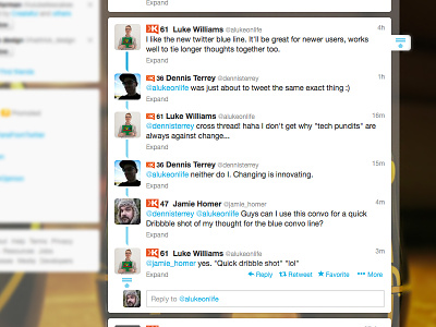
Twitter's Conversation Blue Line
I really like the new Twitter conversation line, but my instant reaction was "who said what first?".
I've just worked up a quick little alternative. A what if, if you will. It keeps all the ui elements that relate to that part of the functionality the same colour (ie. the collapse boxes and line work). The conversation line itself has a slight arrow head to it to subconsciously guide the eye in the reading direction and the first line is slightly darker to guide you to the conversation originator first! All subtle, all helpful!
More by Jamie Homer View profile
Like

