North South Advertising

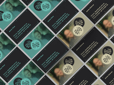
When creating the brand for NorthSouth Advertising, we wanted to tell the story of the two founders. Both Brit ex-pats, one was from the north of England, and one from the south. We took inspiration from a number of classic, vintage compass navigation faces. This allowed us to create something that works in any orientation whilst still maintaining its legibility. The colour palette uses bold yet muted colours that can be toned down when necessary or made to pop when required. A textured logo gives the feeling of durability, reflecting the experience of the people who started the business. The blurry effect on the imagery indicates that NorthSouth helps their customers find clarity in an often blurry space.