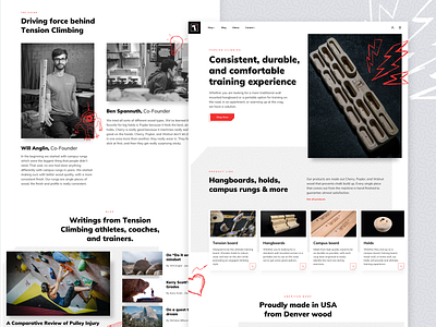
Tension Climbing - Homepage
Lately I took some time to check on a couple of companies I really like and use their products. I wanted to see how well they were doing when it came to promoting themselves online.
Tension board system has been the single best tool in my local climbing gym that I've been frequently using during training.
Although the company made an amazing line of products and a great app, they failed to craft their brand and establish a tone in the digital space.
Random climbing pictures and long lines of text with some product containers left a very dull impression. Other pages followed the almost exact same pattern.
Obviously these guys are more focused on building amazing products in real life, which is what really matters in the end. I personally believe that great products deserve bold digital presence.
This side project is my take one the many flaws I encountered while analyzing their website.
Areas of focuse:
• Typography system
• Clean design structure
• Branding & tone
• Product showcase
• Storytelling

