Milo Health Foods - Logo & Branding

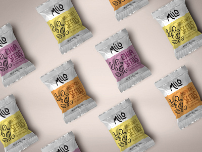


I wanted the voice of this brand to be able to be summed up in a single word. CUTE. I wanted adults and kids alike to have their interests peaked by a simple design that appeals to everybody.
Big hand drawn type with cute little hand drawn icons of the nuts and berries. Minimalism also play a part in the branding. The billboard posters in particular shows this. It uses very little of the provided space to say what it needs to say.