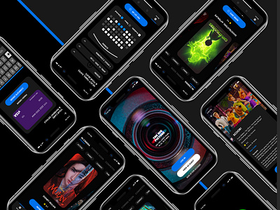
Movie app
Movies and cinema are 2 things I am very passionate about. When the opportunity came up to design an app in conjunction with a local cinema, that was planning on opening in the future, i jumped at the chance.
I like to keep design clean and simple. Not too much going on at once. It lets the eye focus on the screen. Make the experience easy for the user. Don’t make things complicated just because you want to try something new. Make a users life easy to find what they are looking for.
A few things I wanted to happen. Let the movie posters bring the colours to my page. The other elements, such as a CTA's, will then be a separate colour, to guide the user where to click next. Clear signposting to take you through the booking process.
This was all done with having conversations with a UX designer, PO and other members of the company.
If it doesn’t enhance the experience, you do not need it.


