Miami Dolphins Refresh Concept - Logo and Uniforms

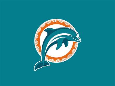
I’m a lifetime Dolphins fan and am not crazy about what they did to their logo and uniforms in 2013. I would be perfectly happy if they went back to their throwback uni’s full-time, but why not try to update the logo as a natural progression from the previous set? Treat 2013 as non-canon and get back to the Dolphins looking like the Dolphins!
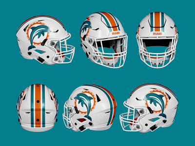
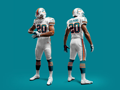
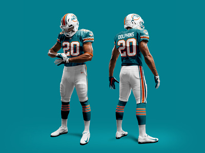
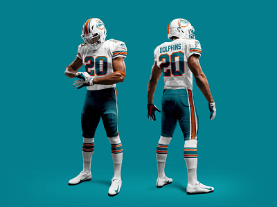
I took a stab at refreshing the dolphin while remaining faithful to the iconic logo’s past composition, brought back and slightly refined the classic sunburst, went back to the lighter and more original orange and darker aqua tones (much like the throwbacks), and updated the uni’s and helmet to lean heavily on what made their past look iconic. I would love to see the team move forward with something like this, similar to how the Browns and Chargers leaned heavily on their iconic pasts, the Miami Dolphins should do the same…
Helmet and uniform templates courtesy of http://www.webpixum.com
Concept Only: Not an official mark of the NFL or the Miami Dolphins