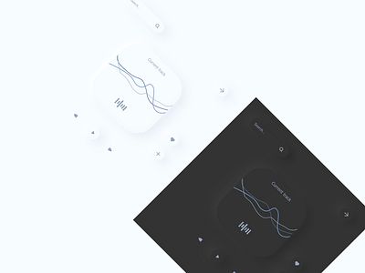
Neumorphic Playlist - Black & White
Playing around with opposing colors! Starting to improve my grasp of designing neumorphic UIs as well as varying color palettes. I adjusted the black color to be more comfortable on the eyes, and the white to have a slightly blue tint. All of the components within this shot are derived from a single component.
More by Maureen View profile
Like
