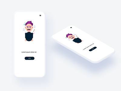
Mobile Design: Simple isometry
Applying isometry techniques in Figma! Lately, I've been by experimenting with Feather icons (absolutely beautiful!) as well as various shapes and colour palettes. This concept emphasizes whitespace (comfort) and clean design. Although not as functional as I'd normally do, this was more a creative expression and pushing my design horizons.
Logo: Lukasz Adam
Assets: Lukasz Adam
More by Maureen View profile
Like
