Barehand Packaging
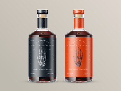


For the last few weeks I was working on a label design for Barehand Brewery's Rum packaging with Bold Monkey Team. We came up with the idea of the most bare condition of the hand and ended up designing minimalist vintage composition with a unique illustration of hand.
Would like to hear your feedback. Which colour do you like more?
Cheers!
Follow me on Instagram