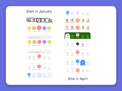
Menu Iterations
A look at all the different forms our menu took during the ideation prototyping phases early on. While I originally imagined a search bar attached to the menu on all pages, it ended up occupying too much space and created unnecessary design constraints in subsequent screens. The menu on the bottom right represents a near 100px reduction in height from the second and third high-fidelity versions on the left.
Color was an important question as well. How do you make it pop without making it distracting to the user? Again, we think that the final version helped to solve that issue.
More by Cameron Joyner View profile
Like
