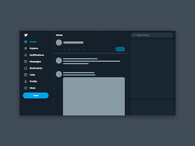
30 Days of Art: (3) Twitter Skeleton Screen
For Day 3, I'm fascinated by the design and concept behind skeleton screens - I think they should be talked about more in UI Design. To my surprise, I found out that Twitter, one of the most popular social media websites, and also my most favourite and used platforms, currently doesn't have a skeleton screen! Even Photoshop has a skeleton screen when you start the program.
I replicated a mockup design based on existing features found on the homepage. I'm a fan of dark mode too, hence the mockup shown 🙂 I think more people should use dark mode and save your eyes if you have to stare at a computer screen for long periods of time.
More by Nadia Le View profile
Like
