Citrine Summer
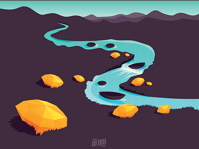
This started as a label art concept, but the client wanted to take a different direction. So I mainly chose colors that I thought would look nice and found that the illustration oddly fit with the times that we are in. I wanted to keep most of it fairly simple (the purple land) as I think it looks complete.