Daily UI / UX - 006
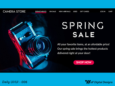
Today's UI / UX entry. This is inspired on a camera store assignment I had for a client. I wanted to create a hero landing page showing a sale, and having a hero photo.
I decided to use the image as an inspiration for the overall design. I pulled colors from the image (carnation and blue) as color accents for not only this section, but also for future areas in the landing page (which will be featured on another entry). I feel using the image as an inspiration and as a part of the theme allows for consistency.
If you like what you see, please show some love by hitting "L", and/or provide any constructive feedback! ❤️
More by Daniel Aragon View profile
Like
