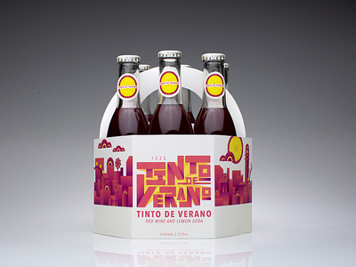
Tinto de Verano Packaging
This drink was designed to be a 6 pack and enjoyed among friends. I took the illustrations from my label design and created a Spanish cityscape using the fan and lemon shapes. The carrier is designed to open up into triangles, inspired by the way a citrus slice opens up to be eaten, and the logo lettering is a continuation of the cityscape when seen on the outside of the carrier.
More by Kristin Brown View profile
Like


